For my print component, I have to create a film festival postcard, so before jumping into designing mine, I wanted to look at real examples and understand what actually makes them effective. I looked at a few film postcards (not a lot available online apparently...) and also one regular advertisement postcard just to compare layouts and see how information is organized. I actually had fun with this one because I love like designing stuff and using my baby Canva so you know I locked in for this one!
One thing I noticed right away from researching examples is that postcards are meant to be quick and easy. No one has time to read a whole paragraph on what it is about or how to contact. The design has to grab attention in like 2 seconds, and the information has to be easy to scan. Most film postcards follow a similar structure where the front is visual and emotional, and the back is clean and informative with usually information on how to contact.
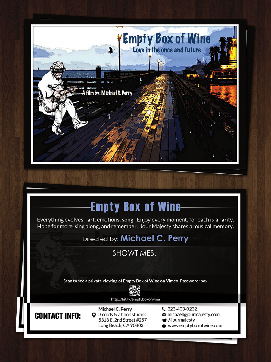
Film Postcard Example 1: "Empty Box of Wine"
What I immediately noticed about this postcard is how the front and back are very clearly separated in purpose. The front is all about visuals and showcasing the mood, while the back is strictly informational.
On the front, there’s a strong animated image of a pier with lighting and reflections, plus the title placed clearly at the top. There’s also a drawn figure added on top, which makes it feel more artistic and unique. I like how the title is big enough to stand out but doesn’t overpower the image. And also by just adding the "Film by:" I thought it was nice to show just the design and nothing else.

On the back, it switches completely to information but it keeps the original design just very faintly which is always an option. There’s a short description of the film, the director’s name, showtimes, and even a QR code. I also noticed they included contact info and a link, which makes it feel more professional. It’s not overly crowded, but it still gives enough information for someone to understand what the film is about and how to access it.
What I like about this one is that it clearly follows a structure:
front is to attract attention, back is to inform.
It’s simple, but it works really well.
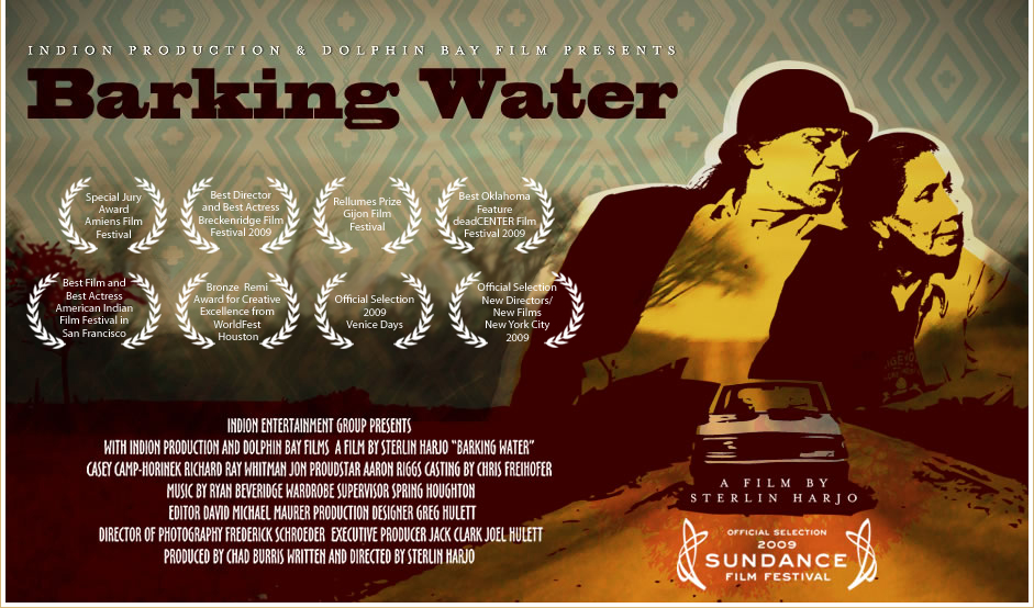
Film Postcard Example 2: "Barking Water"
This one feels more like a film poster turned into a postcard, which is interesting. The design uses strong colors like reds and yellows, which immediately grab attention. The characters are placed on one side, while the text fills the other. I also noticed a lot of festival laurels and awards, which make the film seem more official and recognized. I want to do that I just have to first make sure if we are allowed..

However, compared to the first postcard, this one feels more crowded. There’s a lot of text, names, and awards all in one space, which can be overwhelming. It still works because it looks professional, but it’s harder to quickly read. And there is no back from what I could find so It was all compacted to one side which would automatically make me not as engaged as simplier ones.
From this, I learned:
awards and laurels are important for credibility, but too much information can make the design feel messy, so there needs to be a balance between design and readability.
Regular Postcard Example: "Explore the World" (Back Side)
Lastly, I also looked at a regular advertisement postcard (not film-related) to understand layout and structure better. This one is very clean and organized because it separates information into sections like:
"Our Service"
"About Us"
"Contact information"

Everything is spaced out, and nothing feels cramped. Your eyes naturally move through the design without getting confused.
Even though it’s not for a film, it helped me understand:
how to organize information clearly, how to use spacing to make things easier to read and how to avoid making the back look too busy.
This is important because postcards are small, so if everything is crammed together, people won’t even bother reading it.
Applying This to My Postcard (Draft):

.png)

No comments:
Post a Comment